'Strong opinions, loosely held'
Research. Define. Ideate. Test. Iterate. Repeat.
The sticker is on my laptop. I read it every day. "Strong opinions, loosely held".
It's something most designers are pretty familiar with I think – the idea that through research and rationale we form opinions of how forms should behave or app screens should animate, but we're always willing to be proven wrong with better design and better insight.
There are so many ways to approach design, many of them well documented across Medium, Dribbble and Twitter, all offering varying methods and approaches, all with various degrees of influence from Google, Airbnb or any number of other tech companies that have gone (and blogged or been blogged) before them.
One thing they all have in common though, is that the tools and processes they use, in the way they use them, is unique to each designer or organisation.
So in that vain, I wanted to document how I approach the design process – the steps I take and the tools and methods I use to try to find the best solutions for product and design projects. These processes and this document will change and evolve over time I'm sure, but for now these are my opinions, loosely held.
Research
Customer insight
At the root of any project or design is good research – asking as many questions as you can up-front to give you best understanding of the the business reasoning behind any project, as well as the users expectations.
An article written by Matthew Voshell summarises this research phase pretty succinctly by addressing three facets:
- Desirability: What do people desire?
- Feasibility: What is technically and organisationally feasible?
- Viability: What can be financially viable?
I try to address these questions with as wide and diverse group as possible to avoid any bias creeping in, which is inevitable if you're not completing this phase properly.
Face-to-face interviews with users and stakeholders, consulting best practise, peer review and whiteboard sessions, competitor awareness and analysis, behavioural analytics and session recordings will all form part of painting a holistic picture to complete a rounded research phase.
It's important to use every resource available at this research stage of any project – heat-maps, behavioural data, but most importantly speak to those who will be using the product as often as you can.
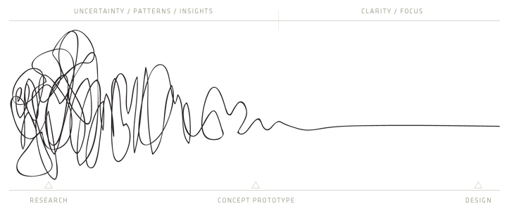
The research can be chaotic and is much as learning what not to do as it is what to do. But effort and time spent here will only make for a simpler, more elegant and more effective solution later.
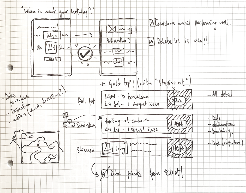
Competitor analysis
Some one much smarted than me once said 'comparison kills creativity', which is true in most forms of design, including UI design. But unlike other forms of design, it's important to understand what patterns are available to the audience at large, and what habits are forming with their interactions with their devices.
With every project, I find it useful to do a quick scan of what others in similar industries and mediums are using, all the while questioning the decisions they have made. As detailed in my Design Team's Core Principles – "[We] emulate not imitate, design research is imperative to what we do [as a design team] but we don’t copy for the sake of copying".
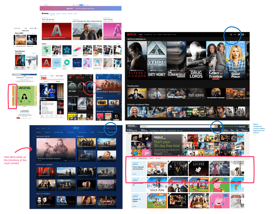
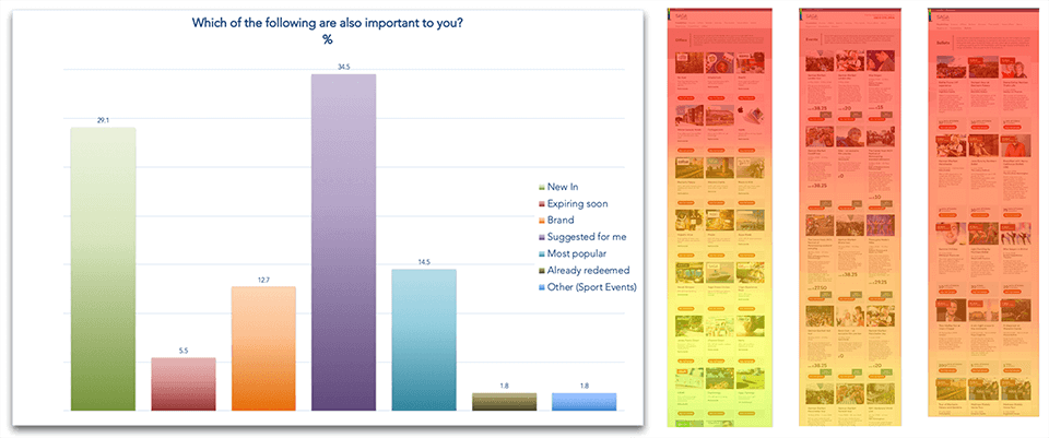
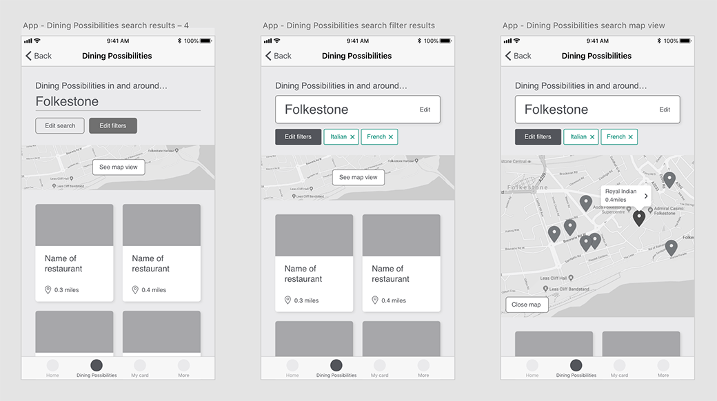
When working on the redesign of Saga's Membership scheme UI, certain patterns and habits were clear during the competitor analysis.
Define
Understand the journey
Mapping user journeys on a whiteboard on a tool like Freehand or Miro is my starting point – understanding the problem, what's causing an issue or making the task you want as simple as possible always starts here.
It doesn't matter how complex these get, it's important to understand where the user may come from and what their goals are to empathise with their mindset at any given time.
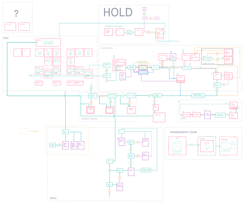
Probably how not to use Freehand, but user journeys can be unavoidably complicated at times so it's important you map every journey and understand the users mindset.
Sketching
Always done with the key stakeholders, sketching is the quickest way to understand business requirements and discuss direction. I tend to use this as tool in briefing kick-offs, and only in those kick-offs. Everyone can get involved and easily communicate their thoughts without being too precious but it leaves things open enough to be creative in the later design work.
For me, sketching – with other team-mates and stakeholders – always get to solution quicker.
💡 Sidebar: getting unstuck
If I get stuck here I'll switch the medium I'm working with. This was discussed on a recent episode of Design Details podcast which made me realise I do this all the time. If sketching alone or white-boarding as a group isn't working or you're getting stuck, then switch to another tool. I like dipping into Adobe XD for this (the keyboard shortcuts are more intuitive for me coming from a print background) where I can really quickly mock-up an element or design.
Also, talk to someone about it. When working on Treehopper I discussed it with my wife and daughter a lot. Neither of them are into design or tech but as consumers they saw things really differently. When working on product UI, I try to talk to engineers about a problem – they tend to have a really practical and linear way of thinking through things that can bring me back on point in a way that I couldn't do myself.
Put simply, whenever I get stuck I talk about it with as wide and diverse group as possible – more often than not, just talking through the problem out loud is enough for me to realise what's not working.
Ideate
Wireframing
I'll spend a large proportion of my time wire-framing. I prefer doing this to sketching as the wires can evolve and grow into design easily. They allow for lots of back-and-forth with stakeholders, designers, content writers and developers – involving people early on in the process without being too invested in any one idea.

I try to start a design doc as if it were the final piece – for example, I know I want a menu button which at the early wires stage might just be the word 'menu'. But if I set this up as component from the start then this is going to save loads of time later.
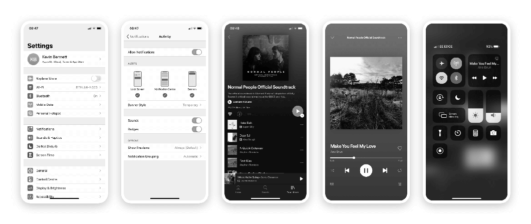
Design in greyscale
My favourite hack of my design process – design in black and white. I learnt this years ago from a great Art Director I was working for – if it works in black and white, colour can only enhance the experience and you'll be less likely to be overly reliant on colour to indicate states or actions.
Some examples below demonstrate this really well. Far right, is wifi on or off? In terms of accessibility this fails in my opinion as its not clear either way. Equally, I love using Spotify but in my opinion the UI is over-reliant on green being a positive indicator for actions.
Design Crits
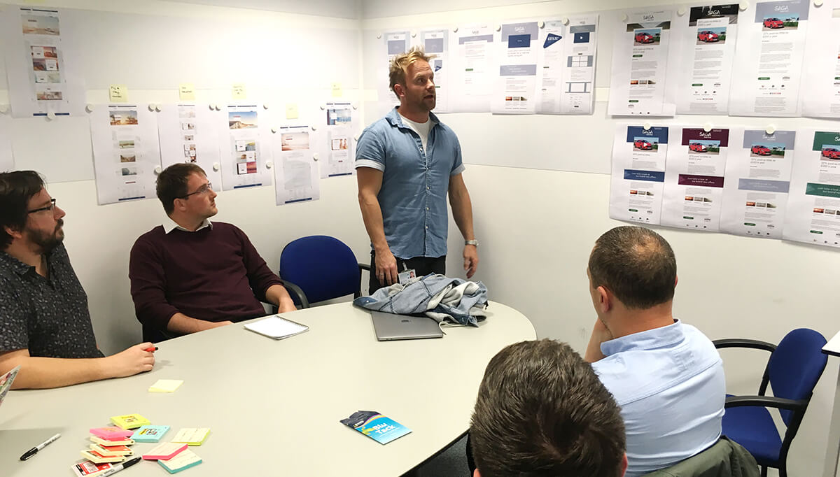
The very talented Visual Designer, Kristian Bakaloff, presenting up a storm whilst working together at Saga.
I find open and transparent critical thinking and discussion really useful. Simply reframing a problem with someone else is more often than not be eye-opening (see 'Getting Unstuck' above).
But I never used to be like this. Quite often I would take criticism personally or see it as some sort of failure (and some would probably agree with that 😬). But in recent years, I've found the process of discussing things early and often to be incredibly productive and important in almost every step of the design process.
💡 Sidebar: receiving feedback
I never realised just how useful me receiving feedback would be to others too (so obvious now that I've thought about it 🙄). But it can be really motivating to the team around you to a). simply be heard, and b). see others receive feedback constructively.
Design system
My god! You do not need me to tell how to build a Design Pattern Library/System/Kit/Fancy-Thing-You-Can-Blog-About-And-Post-To-Twitter – there's a lot of that already.
What I will say is that I'm yet to find the perfect set-up.
Imagine this – a Design Component Library that could accurately generate ship-ready code (in your language of choice and across multiple platforms) but managed and styled visually by UI Designers focused purely on behaviour, patterns and styles – not code – that updates on the fly, to any level brand you that you want. Wouldn't that just be 🙌?!
Well I've come close a couple of times, but in reality, deploying and maintaining an *accurate* and *reliable* component pattern library is always going to require a bit of heavy lifting. The saying of "you can't please all of the people, all of the time" will never be more relevant when trying to find a solution that suits designers, engineers, stakeholders and, most importantly, users.
Design thinking is a human-centred approach to innovation that draws from the designer’s toolkit to integrate the needs of people, the possibilities of technology, and the requirements for business success.”
Practically speaking though, I'll default to taking the side of designers and users (surprise, surprise 😊) – the implementation might be harder in the long run, but technology, or a lack of proper component library, shouldn't get in the way of a good user experience.
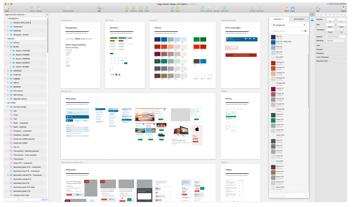
So with that said, the very least I like to have is a solid UI design component library that designers can branch off. It allows me and them to be creative with tools that they're familiar with without being bogged-down *too* much by implementation, whilst maintaining consistency over the design files, at least.
Currently, my team and I then use this a reference to manually update the component library for deployment. It's not the slickest operation, but it is one that allows for both designers and engineers to be happy, and any manual process we just view as sense-checking that allows for further discussion – which can't be a bad thing.
Test
Prototyping
I once tweeted about not seeing the value in paper prototypes – I still believe that. As UI designer, the unknowns I have on project are usually not going to be answered by somebody pushing bits of paper round a table top. I design products for screens – I think if I can produce a super lo-fi prototype on a screen in the same time it takes for me to draw it out, then I'm going to do that.
With design tools and systems being as sophisticated as they are now, prototyping is quick, allowing us as designers to test all elements of UI, including animation, transitions and sound.
Having said that, I think as designers we should always be willing to try any approach that suits the task in hand, and there are some super simple testing techniques that we can apply – for example, you can't beat a simple card sorting exercise for defining and testing a new navigation and IA.
👇 I've discussed which tools I use more in the 'Tools' section below.
I also find that if you start with lo-fi on a device and progress through medium-, hi-fi on that same device, its easier to decipher what makes that product or UI work as you go through that process, rather than jumping across mediums.
Iterate
A difficult part of leading designing is knowing when ship. As designers, its in our nature to sweat the small stuff, to want things to behave well and look good doing it. But I try to ship as early as I can and iterate on the design and functionality in a constant loop of analysing, learning and improvement. Knowing when good is good enough is as important as knowing where to start.
However, this does require good documentation detailing of what you might have compromised on, continuous planning to ensure nothing gets forgotten and a good practise of regularly retros, sprint discipline and team communication.
Working like this, though, allows you to stay close to the impact of your work on people's behaviour as they use your interface and the impact any design has directly on a business, which is also essential for your and/or team's engagement.
Tools
Discovery
- Freehand – when working remotely, freehand is the quickest and dirtiest way to start sketching with everyone 'in the room'. I've probably relied on it too much in the past, using it to document entire front-end and back-end product flows 😬but it super-accessible and quick.
- Notion – there are a million bookmarking tools – I used Pocket for a while or just overly complicated Chrome bookmarks – but Notion's web clipper (for Chrome) is my fave tool for saving back sites for competitive analysis so I can see all the bookmarks at a glance or in detail. Plus, I love, love, love preview or embed tool doing all the work when pasting in urls – great visual representation of that site, saving me from having to memorise every bookmark.
- Mobbin – best time-saver for checking on UX standards and patterns – no more "download app, screen-capture, delete" dancing.
Design
I'm yet to find the perfect tool for every job – every project requires different toolset and I hate to compromise, so I try to choose the right software for the situation. It does mean that sometimes it's hard to return to project later when you've changed the way you work and I've spent more than a few hours migrating projects from one bit of kit to another 🙄to make use of a new feature, or work with a new developer who has a different process, or something like that.
- Sketch – my original go-to tool of choice. It's widely used, has good prototyping support in Craft / Invision but does lack really good support and baked-in hand-over tools. I use Abstract, which in isolation is great, but it does just begin to add to the tool stack.
- Figma – aka. the new kid on the block / trendy up-start. Because of it's current popularity it's getting a lot of plug-in support, which is great and (if you can decipher the plug-in creators notes) makes this is super tool. The dev hand-off is great too with the iOS and Android specific mark-up export options. I've not used the prototyping functions enough yet to comment but first impressions are good. I feel a migration coming on.
- Adobe XD – when first launched it was horrible. But now, it's a pretty solid tool. The sharing functions are great – I love how the art boards appear in the browser in the same way I arrange on the page in the app – it means I can use this for more than just a UI tool, but to document user flows and even product specification. It just doesn't have the expansion or plug-in support of the other big players.
- FramerX – as a UI design tool, it's a little janky – everything feels one-too-many clicks away. But it is by far the best tool for prototyping animations without code (although has some pretty robust code exporting, too).